The Ask
Under new ownership, the Logan Country Club wanted to update their brand to be more contemporary while still celebrating the history dating back to 1932. In addition to the rebrand of the Country Club itself, we also did branding for their in-house restaurant, The Canyon, and their bar, Club32.
The Logan Country Club is an exclusive establishment, with waitlists operating for prospective members. They wanted to communicate a level of luxury while still referencing their values of family and tradition. We accomplished this by using a mix of typographic styles, from classically elegant serif styles to functional, contemporary sans-serif styles. Our color palette ranges from the more traditional and muted greens, blues, and yellows for the main brand to the more vibrant pinks, reds, and oranges used for Club32. Graphic elements include historical photography from the club reimagined with a bitmap pattern, topographic vector drawings, playful icon drawings, and a typographic pattern with words and phrases relevant to the club.
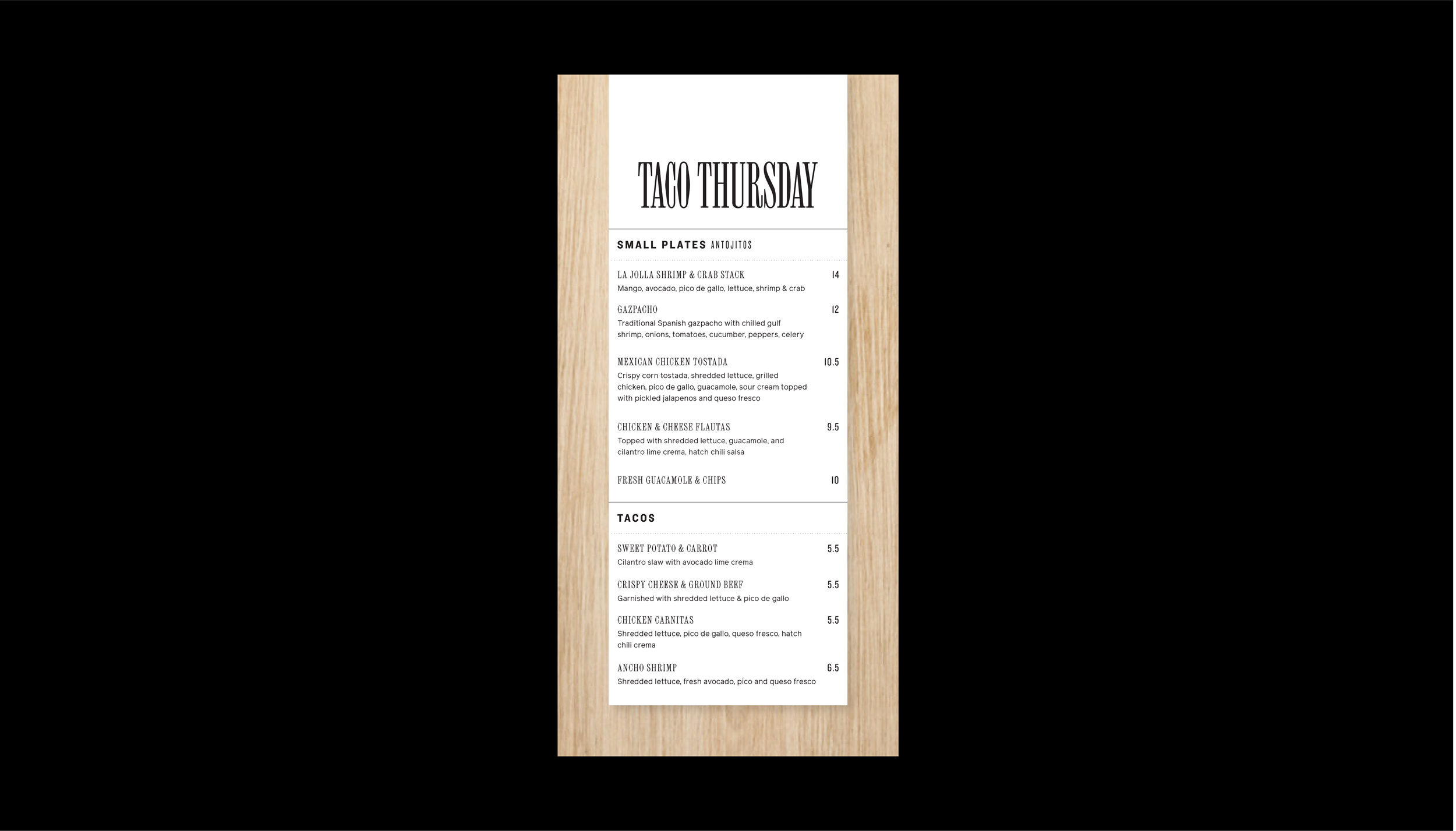
We delivered a complete rebrand, a new website design, a redesigned menu, membership ID cards, as well as a number of other print and digital deliverables.
Skillset
BRANDING
WEB DESIGN
PRINT DESIGN
Credits
Course photography shown here has not been licensed to the Logan Country Club, but has been used for inspiration for the general photography style we hope to set forth as a guideline in future.


